Charting Bush (Continued)
 In spite of all of the noise about swift boats, I think this election (and any election wehre there is an incumbent) is going to be much more of a referedum on the current president.
It feels to me like a problem CEO situation. If you’ve got a CEO who is clearly not getting the job done, then you have to find someone new. You try your best to get someone who is better, but simply making the change is a first step to fixing the problem.
Now I am not saying the GW Bush is not getting the job done. That’s a decision for everyone out there to make on their own. But I do think GW’s approval polls are the single most important data point to be watching in this race.
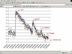
And the best place that I know of to go for that data is a history professor at Univ of Minnesota named Steven Ruggles.
This guy takes every poll that is out there, charts them, and then gives you a five day moving average of all the data points. It feels like a much better way to look at the data than relying on any single poll, be it Zogby, CBS/NY Times, NBC/WSJ, etc.
So, back in May, I posted a chart of Bush’s approval rating where it looked like a ski slope, all downhill, with a few bumps.
Since then, he’s seemed to bottom out. And so, I’ll be watching to see if the numbers start going up after the convention and into the fall or if they stay where they are. That’s the key to this race in my opinion.