The New USV.com Launches In Beta
Taking a cue from the advice we give to companies all the time, we've just launched the new USV.com in beta form last night. It still has a few kinks to get out, but it is mostly there.
When Brad and I first thought about our firm's website back in 2004, we quickly decided it should be a blog and that is what it has always been and it is what it will always be.
Our investment thesis is not a static thing, it is a living and evolving thesis, and the only way we know how to express it is in a series of blog posts in reverse chronological order. As we've added to the firm, our website has grown to include new voices like our partner Albert and also Andrew and Eric. It was time to refresh the look and feel and organization, but we've not changed the goal of the website.
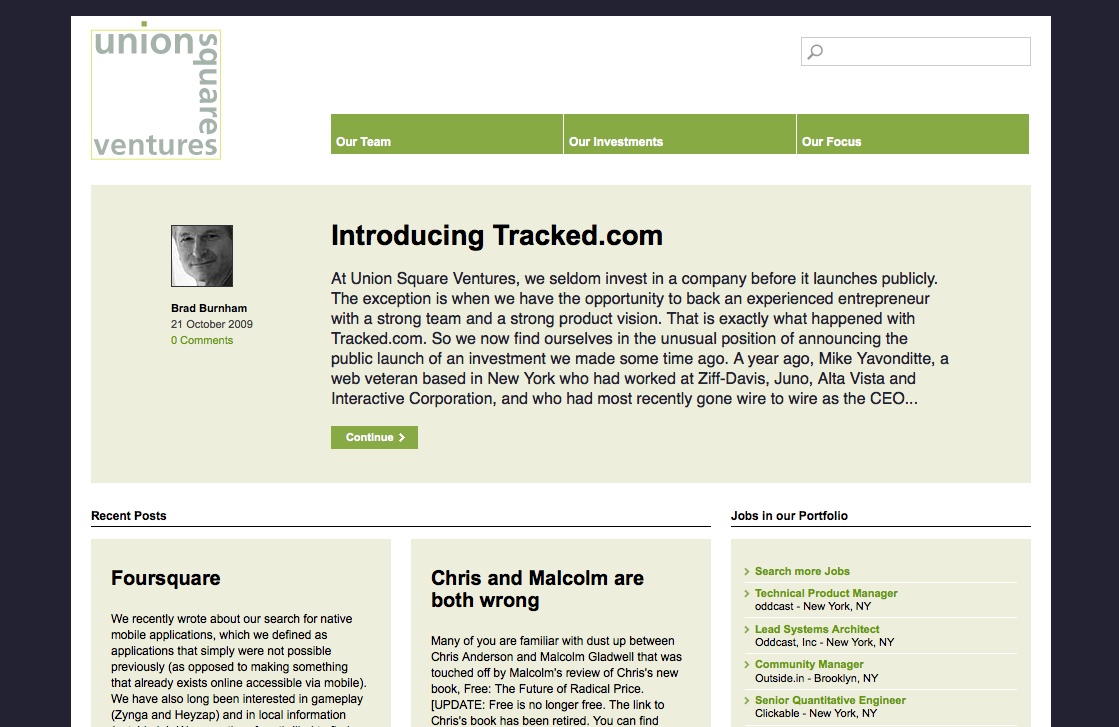
There are three things I'd like to highlight. The first is our "focus" page. On this page we've simply collected all of the blog posts that we've written over the years on usv.com that are about our investment strategy. If you read all of the posts on the focus page, you'll understand what we invest in and why. And as our focus evolves, you'll see new posts explaining how we are evolving and why.
The second thing is the portfolio company page. Each portfolio company has an entire page on usv.com and that page is dynamic. Here is the Boxee page on usv.com. It has a short explanation of the company's business and then links to recent posts from the company's blog, along with photos, videos, and tweets from the company. This page is powered by a slick tool from Magnify. We appreciate their help in making these pages come to life. I think they are terrific.
And I'd also like to highlight the team member page. It is also powered by Magnify and includes a similar set of content as the portfolio company page. Here is my page on usv.com.
The new look is the work of a talented web designer named Phoebe Espiritu. In addition to her considerable talents, she is terrific to work with. The project was managed by Eric Friedman and I'd like to thank him for all of his effort on it.
I'm very pleased with how this came out. Our business and portfolio is changing rapidly and we've now got a website that changes in real time with it. That's the way it should be.
![Reblog this post [with Zemanta]](http://img.zemanta.com/reblog_b.png?x-id=b7c67306-352c-45f9-a3c0-4a05fe5db704)
Comments (Archived):
I like it and the philosophy behind it a lot. It looks terrific.However I must highlight the fact it perpetuates one stylistic device that I hate.A number of “more” and “continue” buttons appear throughout the site. I have no problem with them, but I dislike it when the preceding text ends in “….”That suggests to me that the design is filling the text box with its maximum number of characters and not considering the visual/reading impact. Maybe this is one of the kinks to which you refer, but to my hyper-critical eyes it looks ill-considered, even though numerous web designers do it.In my opinion, it is always better for the box to be filled with a complete paragraph that is comprehensible in and of itself and also inspires one to press the “more” or “continue” button. I wonder what other people think?
that’s a good point John. i never thought about that, but i agree
@johndodds, the blog does have the ability to display full paragraph excerpts (instead of auto-truncated ones) but they just needed to be populated manually by the author. I edited the homepage display for the time being to demonstrate.
looks good …clean, easy, intuitively “interfacable”…and easily digestible in showcasing the “brand.”
We’ve been discussing the best format for a thinking organization. A classical VC web-page format falls short – it’s barely sufficient for a professional services firm. Sequoia’s experiment feels a bit empty. I think they feel they don’t need to really communicate outwards. We’d discussed a site that revolves around the partner’s blogs. The new USV site looks like you have managed to build the ideal model.
wow, thanks!
I like it Fred, particularly the focus page. Although I also looked at it in IE 8 and that page is not displaying correctly for me, I don’t see anything below geography.Also as an aside with regard to blogs am I the only person who thinks that the standard web convention that all links navigate you away from the current page you are reading shouldn’t apply? (I know I can right click or click my mouse wheel). Doesn’t make sense to me at all, I don’t want to navigate away from this site to look at a link you have posted.
Excellent feedback/QA. We’ll get that fixed
Thanks for the feedback – this is now fixed in IE (was a CSS issue)
happy to be of assistance Eric…
I almost never remember to test with IE, great reminder to shake out some of the kinks in the way it renders compared to firefox/chrome/safari.
IE has 62% of the browser market with IE 8 alone having 20%. It’s still the choice of the man in the street (well choice is probably the wrong word!) and corporates. I think it is too easy as an early adopter community to forget this.Actually I think IE 8 is a reasonable browser although I’m on Firefox for browsing and because I love the feedly plug-in and use Chrome for email.
Thanks Richard, I remember reading those stats and thinking, “but how? it’s so slow”.I tried IE8 briefly, it’s much faster than previous versions, I suppose the browsers will converge on high utility but with comparable experiences at some point.
Hi MarkI think you are right and browsers are already converging on that. Personally I think IE 8 has come a long way thanks to the competition pushing Microsoft and given that it is bundled with Windows 7 (apart from in Europe) it’s probably going to maintain market dominance for a while yet.CheersRichard
What is IE?
ouch!fred wilson 1, steve ballmer 0
Very nice .. the team page (http://www.usv.com/team/) looks a bit like Hunted :)The hardest thing to do in this game is actually get a new site out the door… a website is a living, breathing entity that is never finished.. but at some point you just have to let it go..Fred can you pls share with us how long this site dev took from idea to launch?
I think it was about three months. Nobody worked full time on it thoughAs for similarities to Hunted, well you know the saying about imitation and flattery 🙂
Congrats–Clean. Easy to get around. Content rich. Well done!As a branding wink though, the ‘face’ to your brand in this conversation is your big-eyed gravitar and in some ways the keyframe to your community presence. Always challenging to mix that with the corporate view.
That’s a good point. For my personal brand on the web, I’ll always go with the avatarThe usv brand may require something a bit different
Easy fix is to use the gravitar for each of the partners or bloggers as the keyframe to their blog entries under each profile instead of a generic icon. That way there is a hierarchy of brands, from the company down to individual blogs and twitter streams. It’s a great site. I’m just a brand integrity stickler by nature and can’t control myself on this, sorry;)
looking good guys.compiling the investment thesis posts is a nice touch.you can’t ask for more than this level of clarity :-)Sept 06 post -We have two rules:1 – don’t invest in consumer facing web services without any consumers using them2 – there is an exception to every ruleLove it!
I like it, but one of your audiences is underserved: the cold-introduction fundraising entrepreneur.A tangent (you’ll see why) if you will? The VC process is a lot like dating, and funding, eventually, like marriage. You make the same analogy in your usv.com blog post talking about why you don’t fund companies competitive to your current portfolio.In the dating world, you’d rather meet someone through a friend than at a bar — there’s less risk and immediate commonality in the first instance. In the VC world, you’d rather find out about an opportunity from a connection than by the fundraising equivalent of “nice shoes, wanna screw?”But there are a lot of points between those two extremes. We’ve all seen couples which met at weddings, he the college buddy of the groom, she the ex-coworker of the bride. Similarly, by now, most everyone knows a couple which met via an online dating site.My question — or concern, I guess — is how USV.com helps you meet people you’d not have otherwise met. It definitely explains your philosophy, experience, etc. quite well, acting in a sense as your Match.com profile. It even has a small caveat for would-be emailers, explaining the bare minimum info a date has to provide in order to have any chance at a positive response. But I think you can do more to make it less daunting: maybe 10-20 intake questions? I’m not sure. But one of the big pros of online dating is that it takes a lot of the guesswork out of the bar dating scene — you already know important things like the education, religion, occupation, etc. of the potential date. I think USV.com can do the same for you.
The goal is hopefully to have someone understand our focus, then have the lowest barrier possible to get in touch.You are right in that a form with 10-20 questions would filter down and put someonecompany into a pre-determined mold, but sometimes this is not always possible. While some may love to fill out a form and check boxes, it deters others.By providing dynamic information about the portfolio companies themselves it gives even more insight into those you “have not yet met”. You can see latest issues on their minds (blog), opportunities (jobs), and activities (twitter feeds) and therefore would have a much better understanding of who is behind the organization and who, when, and where to get in touch with them. This is how the new USV helps you meet people you would have not otherwise met.
i do a lot of that on this blog
Indeed, and I think that anyone pitching you would be foolish to notregularly read and participate here.
How about blind dates? Sheer curiosity, but they are common from where I am from. Do you all do that as investors?
“a blog … is what it will always be.”I’m sure that was meant in the generic sense, that it’s feed-based and interactive.But “always” is a strong word, and I wonder if a weblog will really be the best form in years from now. For example, maybe some element a la the Google Wave idea will take hold, with real-time interactive discussion as it occurs, or some other paradigm shift we can’t yet imagine…
that’s a good point Ken. noted
now it just needs disqus comments 🙂
Working on it 🙂
they are not working right now. we’ll get them fixed. that’s just oneexample of the beta status
It really is an amazingly cool commenting system.
Disqus is now working again throughout the site.
Since we are talking about Disqus here, I thought I’d throw out a thought.I have a ton of blog readers coming from Facebook. They read the blog post, click the back button, and go back and comment on the Facebook post instead of developing a conversation on Disqus. Of course, others with Disqus accounts comment on the post, so it’s a fragmented conversation, almost with two separate communities of users.I get that the Facebook login button on Disqus is supposed to overcome the objection of creating a Disqus account – but people aren’t doing it. I’ve yet to see a single FB Connect comment on my blog.Long term, these web services need to figure out how to get along better. If you are logged into Facebook, you should be pre-logged in to Facebook Comments on Disqus. You don’t see the need to log in or create an account – you see your name and “logged in with Facebook” and you’re ready to comment.Perhaps the trade off is the comment then floats back and posts to the original Facebook post as well. If you’re also logged in to multiple services – Disqus, FB, Twitter – perhaps the user can switch which “mode” they want to comment in so they can control where comments float back to.I know none of this is Disqus’ fault – the FB API is the FB API – but Facebook and Twitter could do a lot better at being integrated into the rest of the social web. They aren’t going to own all of those conversations outright. So open up and make it easier for the conversations that happen outside of your control to float back into your sphere.In a dream world, the FB comments would float over to the blog, but we know that FB will never let that happen.
Fragmented comment streams continue to be a problem. I also hope that one day a comment can be left once and aggregated everywhere and folks are working on trying to solve that issue. There are all kinds of issues around privacy, sharing, credentials, and other factors which make a system of auto-logged-in-commenting seem easy but difficult to implement. One persons dream feature is anothers privacy nightmare so its about executing on solving problems most users face today, then delivering value and solving problems to the more bleeding edge users tomorrow.This is definitely great feedback for the Disqus guys and a general use case for a power user of these services.
Agree with you…but I see this as more of a low end user feature. The power users know how to use fb connect as it works today.
launching as beta? come on fred, man up 😉 it’s one thing having an app do this, but a web site is meant to evolve, hence beta doesn’t really apply. as well, what this says in effect is that all blogs/web sites are in beta. anyway, love what you’ve done here so call it what you want, but calling it beta seems a tad “fromage” 🙂
it’s beta because if you click around, you’ll see that there are some brokenelements
My wife just informed me our marriage needs to come out of beta.
oh man, that’s a classic andy
I believe Andy must spend at least 25hours per day coming up with comical genius, then browses a few of his favorite blogs looking for “triggers”. I’ve got standup on the brain, just saw a great show over at Governors in Levittown.
Can I borrow that one sometime?
Awesome design. Good work.
well, looks pretty and all, but as we know, the real USV sales site is AVC. i mean that’s where all the cool people hang out to keep their ear to the street. perfect spot to broker a deal!congrats on the site revamp, i’m sure a large portion of the AVC community is familiar with all the hassles involved in redoing a site and the corresponding good feeling of finally getting it out there.
Kid, I’m currently familiar with the hassle of being a Philadelphia sport’s fan. Double ouch.
that was a real disappointment last night. as usual andy reid blew it by going for a 52 yard field goal instead of going for it on fourth down, and the foolish challenge, especially the first one. but with that said hindsight is 20/20 and i thought they played pretty well against a team that knows them very well.
USV and AVC are different. Each serves an important purpose
i know, USV is where go yearbook photo and federal reserve notes, AVC is where we go cartoon avatars and fredbucks. i know it’s necessary (i have to do something analogous with my trading site and my kook blog) but IMHO the great promise of the social gaming revolution is that the game becomes real. so cartoon avatars and fredbucks ftw!
the whole point of having both USV and AVC is that if anyone comes to pitch USV and isn’t familiar with AVC, they don’t even have to waste the time and can just show the poorly prepared pitcher the door. 😉
lol good point 🙂
oh hey i just noticed new pictures of everyone! lol, that is always the most fun.
I noticed the new pics too – and that while I look increasingly haggard (and increasingly bald) each time I end up on a new website – you guys are looking good!Site looks great – congrats.
They are not new photos. Just stuff we pulled from flickr
I like the look -Also, why did you you choose a magazine style? I think it was useful for you- but in certain ways it makes life confusing. Why is Brad’s thesis on Chris and Malcom being Both wrong next to announcements about what you invest in after you invest in them. I wish you guys would find a magazine format that would allow you to separate these two blog functions in magazine format easily and highlight them visually. Right now in the Hierarchy of vision they are equal, and I don’t see how they relate. I’m assuming that when someone writes a new post, everything will one one over left and/or move into the archive?That’s sort of confusing for me. Can you make it so that you guys have a column of USV’s thought’s and USV’s Announcements. And Allow the Thought’s Section to have pushthrough from Here, and everyone else who blogs. And also allow it to be differentiated visually somehow…I’m not describing this well. I should copy the webpage, and then alter somehow….One last thought- Change your logo box so that it is slightly golder by either doubling the pixel width of the box or deepening the color slightly. It could stand out as a logo more that way.Bleh…(Not meant to be taken negatively, I do think it is a step up, I just auto-turn on art critique on when someone asks to look at something visually..Now I wish I knew how to design my own logo, I suck at it.)(Also I love the font. Sort of obsessed with fonts right now…Really lovely font, and I am tempted to check which font it is… What a lovely Sans, What a correct use of Arial, though I have a slight preference towards Helvetica…very crisp on my Mac. Beautiful)
You can always use a mockup or balsamiq to help illustrate your thoughts.
Ok, since I am only a beginner at this. Plus I am still in recovery from having my concious-art peice deleted. I’m in a serious funk. I have no idea what I’m doing about that yet… I’m still trying to teach myself Javascript and it is not going mysteriously well, though much better than my Java nightmare crash.Both the piece “Foursquare,” “Introducing Tracked.com” and “Chris and Malcolm are both wrong” all have have the following characteristicrel=”bookmark”This is going to affect how the page loads in both the Javascript and the CSS. You currently have a dark blue/neutral extremely pale green-brown/mid range green grass going for you (Plus black and white). Do something to allow for the fact that in both the Javascript and the CSS that “Chris and Malcolm are both Wrong” should be marked slightly differently, no matter what page you load. Perhaps that gold color that’s in your logo should give a 1 pixel outline, dotted. That would require you not marking everything asrel=”bookmark” and figuring out how it should switch off in a magazine layout.That same space should also be updating stuff from everyone’s blog, so even if you aren’t coming here, we know you have written. Same with Brad, or Albert, or Eric, or Andrew.What all of you say matters. It also stops the clicking around to find each person’s personal thoughts on the same subject matter, if it is collated into one space. We’ve all been talking about how important this idea of collation and aggregation is. You should aggregate yourselves. And become some sort of collective frontpiece being that is USV.And we should see Dorsey’s tweets in front, mixed into everyone’s. Hi! We like you! Stop hiding from us… I didn’t even know that was there.
Oh I found a good javascript documentation page (it’s on 14million ways to skin a cat). I might have some pdfs laying around about AJAX too. All this web programming stuff is new to me as well, and I’m often at a disadvantage due to years of desktop coding. I’m always fighting to get to the code past all the complicated frameworks (apps, controls, views, tests, tests & more tests).
hehehe. I’m a beginner at just programming. But I like the web, so therefore I must try.The problem with AJAXifying the world is it makes the website unusable to things like JAWS!. That’s mean, and I think technically illegal in the US, but no one will prosecute you (note to people who script too much, techincally you should be coding to WAI standard. How many websites, especially fancy websites, do you see really coding this way, it’s really unusual.) Plus I think AJAX currently isn’t optimized for mobile phones, and I think this page is.
You have to become a web designer. You have the requisite amount of obsession (in a good way)
I can’t sit still long enough to get through the coding alone. I know my weaknesses. I was trained in high theory, and then they said “Practice you shall learn by hanging out and doing, and if you get the money, you can hire someone” (which is true, but not a very me thing). I prefer the studio thing. I like my open desk, and a lot of people around, and we sit and talk about what we did every 45 minutes to an hour to figure out what went wrong/right/change/unchange/good/bad- with no judgement, just as a statement of growth and change. I think it is one of the best ways to learn anything. And I think I need a vacation before I go do anything. I’m starting to burn out from school.Oh and Art Dova is alive. I feel like crying right now. OMG… Now I have to figure out how to talk to facebook and potentially find a lawyer, and tweak it for the Rhizome artbase.
And I prefer overarching product design/HCI from top to bottom. The Art Dova project proved to me that this is a world that runs uhh, non-Euclidean parallel to the “real one” The cell phone and the web page both need to be designed with that idea in mind…
Excellent job bringing in the dynamic content. I developed a landing site to bring cohesion to the Pittsburgh startup scene, and one of the things I realized was that we could grab the Twitter feeds from all of the startups in Pittsburgh and have them on the landing page. It provides incentive to visit the site more often.I would suggest removing the Recent Posts section and replacing it with an amalgamated stream of all of the feeds of your investment companies. Logo on the left for brand association; then a brief of the feed; then a link to the feed, USV landing page, and company page. People would visit more often to find out what’s going on with USV investments. The blog post theme is nice, but what mechanism would allow interested parties to better learn what is going on with your portfolio without having to navigate through several pages?
Interesting idea
Very clean, very intuitive, and does an effective job of communicating the identity and mission of Union Square Ventures. I almost wonder if it would be even stronger if the navigation buttons at the top were re-ordered to emphasize USV’s focus and then allow visitors to see how the portfolio companies flow out of that philosophy, but things look great overall.
Congratulations Fred. Are you guys going to “communitize” the site? Much of your deal flow comes from the community but the site does not harbor conversation, only speaks to it. You are the quintessential VC firm who can create it’s own community or place of interaction – leaving that on the table.
I think having open comment threads around every post and content that comes from us solves this problem well. It keeps the attention on the post at hand and opens the door to get in touch if its relevant. Putting comments elsewhere may be confusing if its not a two way dialogue.
but is there something more than “commenting.” Ultimately, your website is not a blog. Are there areas to exhibit interactivity?
We are open to these features if they provide value – what did you have in mind?
How should we do that?
some “blue sky” ideas:1. an “investment meter” that people can contribute to in order to judge which areas for investment are interesting (i.e. Adobe AIR apps, personal finance services, micromedia platforms, etc). This helps crowdsource an investment area.2. A wiki for investment thesis (or something similar) in which people can participate and add their own thesis3. USV Network – a job board and network for your entire communityetc.
Congratulations on the new look/content. It looks very clear and straightforward, which is a reflection of your operational style, as I understand it. I think you’re elevating the level of transparency on how VC’s communicate with the open market. I can’t recall seeing another VC site that is so transparent. The dynamic hooks are definitely a key feature.
Like putting a fresh pair of socks. Feels good.Congrats, great job.
One last question: Does the site check out for implementation for stuff like JAWS!? I could imagine a blind web entrepreneur coming up with a product that is about SAAS -but it would be very hard to get to you if the sight isn’t compatible with stuff like JAWS!.
@ShanaC: Yes, I check for accessibility and validation for the areas that we can control but can’t guarantee the same for third-party scripts that are integrated into the site. In fact, during our meeting, we discussed including affordances for color-blind users.
You are awesome for that. FYI, I happen to like your color-scheme, and how do you check concordances for colorblind users? I have some colorblind friends, they apparently do see some sort of color- it is just not what the rest of us see.@ Disqus- are you JAWS! compatible? Your considered third party in this discussion I assume. I know that Narcissus, using the whole AJAX thing, is probably not, but can the comments themselves in Disqus be read by JAWS!?(the apostrephe is part of the name.)Any other big questions we have here?That should be affordances, doing the homework thing.
Just a short input:- there is really a lot of space around elements; in particular between post body and footnote on the front page – it’s a bit of a waste- the header: team, investments, focus – very clear; would add ‘contact’ as well (I know it’s bottom right, but not everyone scrolls there)- great stuff ‘Jobs in our portfolio’ – this really rocks- I would add some hierarchy indicators – for instance in the ‘our focus’ it’s hard to tell what’s the bottom lineIn general – great focus on giving rather than showing off – double thumbs up for that.
Excellent feedback and critique. Thanks for taking the time to do that
I like the investment pages with all the different feeds…I think it might be interesting to see a aggregrated feed of all your investments in one. I wonder if interesting trends and observations would emerge from seeing all your portfolio companies actions, events, and developments as a part of one unified stream.
hey Fred .. your teamstream feed is exactly this 🙂
I wonder if its too much though. Interesting suggestion for sure
Some quick SEO tips…-Since both USV.com and UnionSquareVentures.com work, add a canonical URL tag to every page. Even better, 301 redirect all of the UnionSquareVentures.com URLs to USV.com URLs.-Add a meta description tag to the homepage. Won’t help in ranking, but an easy way to control the snippet displayed on the search engine results page.-Add an alt tag on the logo with you most targeted keyword (e.g. [NYC venture capital])-In general, review the alt tags and page titles for keyword potentialNo reason you shouldn’t outrank “The Official Site of the United States Volunteers” for the phrase [USV]. 🙂
Speaking of which, if you type in avc into just the firefox http thingamabob bar you often get redirected here:http://www.avc.edu/Depending on location in the country. Yup, you can be a community college.
Ugh
Thanks Jarid. You rock
Thank you, Fred! It was great working with Eric and your team 🙂
really nicely done – congrats!
Thanks sue
Congrats! looks great. I wish i could Fan that page 🙂
“When Brad and I first thought about our firm’s website back in 2004, we quickly decided it should be a blog and that is what it has always been and it is what it will always be.”#revisionisthistoryWhen I got there in Feb ’05, you had this awful brochureware site: http://bit.ly/1gxz5Z (pics are gone, but you can see the layout.The blog as a website was my idea. :)I had built a website for the Hoboken kayakers in May of ’05 in Typepad: http://www.hobokencoveboathouse.orgWhen we realized that no one went to our site and that we needed to get Brad blogging, I fought for the “it should be a blog” concept.Given that you’re at the social recruiting summit today, you can understand why I’d like the web to accurately reflect my job history–since I don’t use a resume anymore. 🙂
it may be revisionist history but i can’t remember how we decided ithonestlyif that’s how it happened, i am happy to revise my posti’ll talk to brad about it today
It’s fine… I’m just poking the bear. 🙂
if it’s a legit beef, i want to address it