AVC Mobile
I am interested in getting everyone's opinion on how AVC should render on a mobile phone.
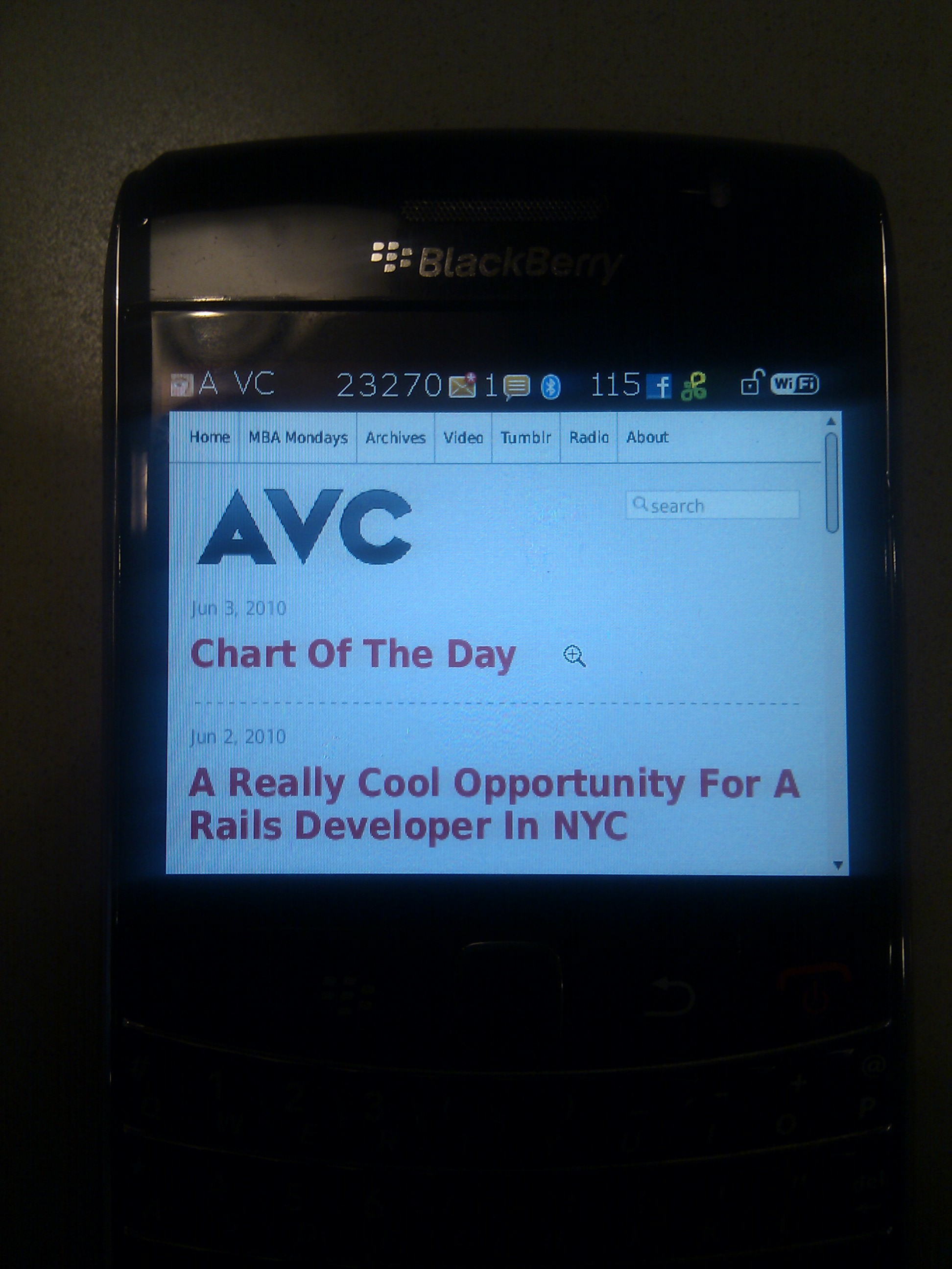
Here is how AVC looks on my blackberry:
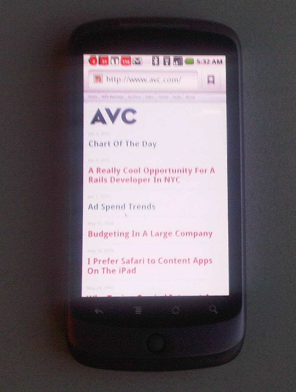
And here is how it looks on my Google phone:
AVC on the iPhone is pretty similar to the Google phone.
So here is the question. Do you all prefer this headlines only mode on the mobile phone, or would you like the post of the day to show up immediately and then followed by links to the older posts (my preferred way)?
Place you vote in the comments and we'll go with whatever is the most popular choice.
Comments (Archived):
post of the day to show up immediately and then followed by links to the older posts
i’m not much of a mobile web user, though i vote text first (fred’s preferred way).
post of the day first
I like going straight to the content. Please post the text first.
post of the day.But….Disqus on mobile – has to be the most important thing to get sorted.I think you should have embedded a poll into the post
Post of the day please
post of the day
Definitely full text of post of the day, followed by links. Makes a huge difference to have the text right there. Mobile web is still just slow enough that second click can be a big deterrent, especially if I’m trying to load the page before I get on the subway.
Hi,I prefer being able to see the most recent post first then links to older ones.Cheers!
In my blackberry, it shows all the 10 or so posts with all the text. I prefer that since if I miss a day’s post, I can just catch up by scrolling down instead of clicking through…
post of the day + headlines
Post of the day = 1 less click to the user
Post of the day please.
post of the day, then archived posts
Post of the day (with content), then headlines for older posts.
Keep it simple. I don’t thnk people need as much information as you think they do.
Post of the day, then headlines for older posts
Full text of post of day + links please
As Bijan just complained on Twitter, the phones bounce in and out of coverage. Therefore; I believe on the first download, I want some info without having to count on the network to get me “more”.
Looks good! Keep it simple, it seems like the post of the day is a popular input here. If anything, possibly consider placing a larger up and down arrow, or previous post button next to each post. Another idea would be to show popularity of posts and/or tagged categories.
Hey Fred,I think this is pretty straight forward – what percentage of your visitors visit daily (or at least multiple times per week)?If it’s significant, go for the full text of the latest post + links to older ones.I for one am a daily reader (and I assume most of the commenters are as well) so for me personally, I’d have to vote for the full text + links.-Wayne
Post of the day, followed by links to older posts. Provides a better overall UI, while keeping the most relevant (i.e. newest) content front and center. Also, nice job grabbing audience sentiment on the change. Well played.
Full post then headline links please
Perhaps your mobile site could be your phone number? And then we could call and you could read it to us?This way you are fully backwards compatible to all mobiles, except for iphones which cannot actually make calls.
yow, that is one of the scariest ideas i’ve heard this week!
On Iphone, linking to this comment from email looks really great, but, can’t like or post from iphone to say that.
I’m actually going to go against the grain here and say I prefer links first. Most blogs I follow I’m not able to read daily so when I do get to them I like to be able to quickly scroll through headlines from last several days and pick most relevant content for me…
I like the big initial article way.The header menu is hard to read on my iPhone, though.Chris Kubica
Also, the search box is might wee on my iPhone also.
I would prefer that the post of the day show up instead of the headline only mode.I believe most of your readers are keeping up with your posts and would prefer to have the newest one presented
On top, I’d put the post of the day with an excerpt (too much scrolling to go through the entire post to get to old posts) and # of comments (# comments implies how much the post inspires one to think.).If possible, on the old post add # of comments/#new comments today.
no doubt.. post of the day to show followed by links to the older posts
Today’s post.
I prefer seeing the entirety of the first post. Frequent readers, who probably make up more of the mobile audience, will have already seen the headlines of the previous posts.
Personal preference for iPhone is to have it load the current post followed by links to older–the current headline-only setup was actually the only thing I dislike about the redesign.
Post of the day, followed by links to older posts
I prefer the post of the day to show up immediately, not just the headline. Headline only reminds me of WAP browsers on old phones.Also: wow you get a lot of emails and notifications. I can see why keeping up with it all is a challenge.
Fred, so far you have consistently shown respect for our time, by not wasting it with the need to click through to read a post. Please continue to do so by giving us the post of the day in full, right there. Given the form factor, I have no problem with links to older posts …
I don’t always make it every day so I prefer the headlines.
Full text post of the day, links below. I use my mobile browsing to stay current, and rely on larger screens for researching/delving into the past and it’s nice to avoid loading that extra page.
Full post followed by links- there are groups of people who don’t care about comments etc, and just want to read the text.
i hit the site on my iphone today and thought why do they just display the titles and make me have to click on something just to read the latest post….then i read the post….nuff said?
a mind meld
Full Post of the Day followed by headlines makes most sense. If people are reading you everyday or most days they don’t need links to old posts as much as content from the newest one.
I think that it is nice but due to the fact that in certain markets – particularly NY – 3G is extremely slow I would lower the payload in both design and content. I recommend creating a simpler design and breaking out features such as comments into separate pages, although the post of the day should be front and center as that is usually what most of us come to the site for.This is not a reflection of the design but the realities of the mobile world we still live in.
we did lighten up the payload dramatically with the redesignmobile was a big part of why we did it
Post of the day.PS: love the new site; looks great on the Nexus One.
Post of the day
My vote: Post of the day, followed by links.
blackberry looks way better
I agree. It’s downright beautiful on the BB.
I’d go with post of the day, followed by links. I do want to mention that the site looks a little weird on my Pre since the revamp. Sometimes the font gets all screwy inside the post and some lines are in a larger font than others. Not a deterrent but it does makes me squint. :-DAs an aside, Disqus behaves a lot better on my Pre after the revamp so it’s a decent trade-off.
I agree with you. Showing content is what one comes to the site for. An additional click to get to any content is annoying. BTW, your “like” button is ruined by facebook’s like button. I think you should remove it. Those of us who don’t aopreciate the FB feature are turned off and those who enjoy it will be disappointed when it is not FB.
Definitely the latter – too little info is a turn-off on mobile-specific sitesThere’s a temptation to treat mobile as less capable than laptop browser, and therefore want to deliver a more compact presentation. For some sites that works really well (I like REI’s mobile pages, they help me get done what I want do really well), but for others its a HUGE obstacle to try to get to the ‘real’ content. I use Android (N1), and it kills me that I have trouble getting to the full facebook site, it keeps throwing me to ‘mobile’ or ‘touch’. Modern mobile browsers are very capable, very often we dont need or want a dumbed down page. For some sites it is no real value seeing a cut-down page, we want the ‘real’ thing.
post of the day to show up immediately and then followed by links to the older posts
Post of the day followed by links.
Why not show the headlines with summaries? On the go, headlines and brief summary are what I need to make a decision on whether or not to keep reading.
that is a common suggestionbut when i come across that approach on the web, i don’t like itdo you think it works well in mobile but not so well on the web?
I agree with you Fred – on the web, full (current) article followed by links works well – easy to see the new stuff and navigate to the archives… but on mobile, the real estate is just too small – the time to navigate down to the links almost guarantees I won’t do it – but a link to the headline + first paragraph gives me what I need quickly, then can click to what I want/need on my mobile. Not sure how you get it working differently on mobile vs. web unless you do a m.avc.com site?
Full post, then links
23,270 unread e-mails on the BB! Something must not be syncing right.
i get a ton of email unfortunately for those who want me to read something they send me
Post of the day showing up on the front page is preferable.I do think you need to get to those 23K+ email messages waiting on your blackberry though.
yeah, yeah, i’m getting to them someday 🙂
…and this is AFTER you filed email bankruptcy???
As many full text articles as possible, without comments. It should really be several articles if possible since a lot of people don’t check the site every day. I agree with many others that mobile web latency is the significant issue here.Also, if there are power users of your blog who just want a headline list, they probably already have it via Google Reader or another feed-based solution.
I’ll dissent slightly and say summarized post of the day, with link to full post with comments, and then links to older posts.I use google reader, so I rarely go to the avc homepage from my phone, except to read comments on older posts, and for that use case, the list of titles with comment counts would actually be most useful, but I think the blended summary and links is probably a fair tradeoff.I don’t buy the “don’t waste our time with a click” argument. If you’re engaged with the content, the time spent waiting for another page with richer content to load isn’t that big of a deal, and seems worth it.
Unless you’re on the Q train over the bridge and you’ve got a few seconds until the signal is lost. I look like a weirdo frantically opening windows, loading reader items, clicking back so I have enough stuff to read until there’s a signal again. Sometimes one less click can make all the difference.
i’m with josh on this one. flaky wireless is still a big part of my life
fair enough 🙂
Post and then links.BTW, my Blackberry doesn’t detect the mobile version and shows me the full one. Can anyone help? It’s a Bold and I’m using version 4.6 of the SO.
Are you resigning yourself to posting only 1X daily?I prefer headlines with a few lines of body copy, when applicable. I think it makes for a better UX, letting me choose my own Fredventure.
i don’t often post more than once a daybut i do occasionally
Run an A/B test for a little while and go with the winner. Can be tough with a blog, but segmenting should point help point to the right choice.
diff topic re the website: you’ve axed the prev, main, next links at the top central part of the page when reading any article or the homepage. I used that a LOT, particularly if i’ve missed a few days of reading this blog and can see at a quick glance whether i’m behind. my vote there is to have that back…oh hang on: i now see that instead, buttons have been implemented way down at the bottom of the page now. First point: there’s an error. “next post” really brings one to the previous post.Second point: prefer ’em back at the top.
I second having the next/prev back AT THE TOP. For an infrequent/new visitor, you’ll get better click-thrus and longer visits.
i asked nathan to do that this morningi totally agree ken
+1
Really like the “next” & “previous” at the bottom, but miss the links at the top.
we’ve now got arrows next to the top of each post (small and subtle) thattake you to the previous or next post
Noticed that this morning!Good tweak!
nice!
I would definitely prefer that you show the full text of at least one post (if not headline + slug for 2-3 after that in a WebKit UI). Or if you wanted to get really fancy, you could show headline + text for the first post and then show headlines with a way to tap to expand the text of the following stories (similar to the way ESPN or MSNBC’s mobile sites expand their menu’s without reloading the page).
cdixon.org renders really well in most of my mobile environments – the headline and start of the first article generally fit on the front screen. And if somebody wants a list of articles the ‘Contents’ link is right there (what’s the point of calling it Archive, it’s not nearly as appealing).Also note how little space the blog title uses (cdixon.org), and how that doesn’t matter. The ‘AVC’ logo is pretty large and wastes a lot of screen space to right right. Something like this would be better all in one row: AVC(small stylish logo) – MBA Mondays – Tumblr – ContentsThat would use a minimum amount of vertical space. You’d lose the ‘Video’, ‘Radio’, and ‘About’ links. About can go elsewhere on the mobile page. If Video and Radio make sense on mobile, you can include them somewhere else.
Headline + first paragraph for post of the day, headlines only for all other articles.But… It depends… Try to compare the mobile theme to existing mobile pages that are well done. Here some of my suggestions:1. Nominal vs. verbal headlines. You use a lot of nominal headlines where it is hard to infer the content and therefore you need some text to bait people into reading post. Verbal style already implies the content and with such a style you do not need much text to bait people. Example: engadget2. Fonts: Compare topic vs. content vs. comments. Topics are too large, comments are too small. Good example: Your own tumblr site.3. Shape: Well-perceived mobile sites have distinct shapes to distinct between posts. Boxes with round edges always look nice on mobile devices. Example: Again, your own tumblr site.I guess the conclusion is to get some inspiration from your tumblr site.
That’s probably the smartest response about headlines and how mobile sites work yet…
maybe i should just move this blog to tumblr!
agreed
Full post first! Then headlines.
I’d like to see today’s post displayed and links to the others. BTW, Disqus will not allow me to post a comment from my iPhone.
I vote for a dedicated app for each mobile platform featuring an augmented reality interface written entirely in HTML5 with geo-location and social gaming features. Anything less would just be lazy.In lieu of that, featured post.
wise guy 🙂
1) preload the full text of the latest 5 posts2) preload images of the latest post (many times graphs and spreadsheets in your posts are not just illustrations, but an important part of the content)3) display titles of the last 10 posts4) display the titles *and* excerpts for the last 5 postsrationale and desired effect:when you tap one of the last three posts, the text is displayed immediately along with any images.most often this will be the latest post, so the latest post will always render fast.if you would like to read older posts, maybe you missed yesterday’s article, you still get good speed.if you would like to go further back in time, it’s still readily available. if you’re digging back it means you have time and you can afford a few seconds more so it’s okay if you don’t preload the full text of older posts.I would personally add a categories menu at the bottom, say if I want to read specifically MBA Mondays for example.further thoughts: what about comments? I don’t mean to display the full thread on a mobile. but how about enabling the post for entering one single comment right there?
No question… full text post of the day and links for the rest makes much more sense on mobile.
Hey Fred, go to your inbox, scroll down about two weeks, then select “delete prior” on the blackberry menu. That should leave you with only half of the 23,270 unread e-mails… 😉
i knew someone was going to comment on that!
I think that the headline only mode is a fascinating idea and seems quite effective. I’m subscribed to your blog so I’ll read it in my reader. When I visit your site on my iPhone, I would think it would be when I’m looking for a particular article. In that case, the headline only mode works great.It seems it’ll also encourage interesting headlines. :)-1 on going with the most popular choice. The crowd / committee is often wrong. 🙂
I always come into AVC posts from igoogle on both my PC and iPhone so I’m already looking at the post I’m interested in.If I was to come direct into avc.com I would want post of the day open with the others as links.
Most recent post, then titles of other posts.
Post, followed by headlines with link to web (non mobile) version.
interesting
Interesting
Fred (or anyone else),This is a little OT but I have a question. I’m a young entrepreneur from KY. Me and a friend/partner are currently narrowing down a couple really good web/social media ideas we have and in the near future will be looking to start the process in bringing it to life.We are both very entrepreneurial minded, business majors, and both are motivated and determined to make ourselves successful. I understand how the internet and media work from a business standpoint, I have a slew of websites I’ve made money from in terms of affiliate marketing and product promotion. I have blogs and have done internet marketing consulting work for local businesses.The main problem we have is neither of us code. I’ve read where you said one of the biggest mistakes people make is outsourcing a project. How would you suggest we go about finding a good coder to join our team? Like I said neither of us code and neither of us really know how to code. We know what we want, we know the features we want, we know how to monetize the website, we just can’t code it, and if you put a great coder in front of me and a bad one I wouldn’t know the difference.I understand that this 1 person on our team could make or break the startup and I need some help on how to make sure we can and do find the right person to work with us. Thanks in advance!
dpearce, have you looked into any user groups or tech meetups in your area? I’m a bit spoiled, being in NYC and all, but there are lots of great meetups here where programmers and designer and product people get together to share ideas.I would wager that if you are feeling the need for a developer, there are probably a decent number of developers in your area that are feeling the need for a business person to guide and inspire them 🙂
Hey thanks for the response! I actually have a pretty good idea of how to find developers, especially with all the social media outlets, but my main problem is more how do I tell what a good developer is?When am interviewing developers is there anything specific I should ask or try to determine? I don’t want to partner with a developer that can’t write good code, and I have no idea what good code is. Does this make sense?
I wish I had a great answer for you 🙁 I lead a development team in NYC and still don’t have a good answer here. I’ve hired great programmers who turned out to be horrible and I’ve hired programmers on a ‘part time’ questionable basis who turned out to be great.The only thing I can recommend is to go with your gut. If someone sounds great but doesn’t come off as someone who genuinely CARES about what you want to do. i.e. if they spend more time negotiating their salary then asking questions about your ideas and ideal company.. then they’re probably not worth your time.I also like people with a ‘hacking’ background. I don’t mean the term ‘hack’ that people throw around nowadays, I mean exploits, viruses, website defacement, etc. These guys are truly passionate about what they do and they worked on topics that had no ‘documentation’ whatsoever and had to do their own thing. Just make sure those days are behind them ;)Hope that helps!
Thanks for the tips! Yea that does help. After a little google search I found this article too, which has some good insights and things to ask:http://inter-sections.net/2…If anyone knows of other articles or blog posts like this please share!
Headlines looks better to me.
IMHO the best blog theme is in use on TechCrunch.com. Look at that on an iPhone and see if you don’t get darned near everything you’d care to get (first article in expanded form, a badge stating comment count, headlines of second and older entries). Of course, that’s a WordPress theme and you’re not on WP I don’t think…So, I’d vote full post on latest entry with headline only for subsequent.
Agree !!
I have to admit that while I love TC’s mobile site (specifically for the reason you explained), TechCrunch’s little “arrow” system for expanding/collapsing articles needs to go.Gerald + Richard have it right – Summary of first article plus headlines of the rest. That’s my vote 🙂
post of the day please and let comments etc load just as swift as post of the day
Post of the day, followed by links to older stuff.The less clicking the better.
Full text content of the day
I strongly prefer the text in the email on my Blackberry. The browser is so slow and presentation so difficult to control that I rarely click on links in emails. I do note however that I have trouble scrolling down AVC emails on my Blackberry, more so than with other emails.Fred, I really appreciate your blogs. They provide excellent insights. Keep up the good work.
On my iTouch I get the full article plus all the comments at once which take ages to load.
I read A_VC from tidyread, it looks great too.
Love the new mobile-friendly UI for reading AVC on BB9700! Biggest issue with it has nothing to do with headline/post tweaks. Unfortunately, Disqus comments either do not load or take a very looong time to do so on BB browser. Since, as Fred points out, much of the value of AVC comes from the community, it means I have to make a mental note to return to the site when I’m back at my laptop. This comment is a case in point – read the post yesterday while on the road, but did not get to engage until now…probably too late to register in the discussion!
Full text first!
Full post first then headlines & links.If I look at AVC on my BB, it’s generally because I’m looking for the latest post and want to get to it quickly. Also — re idea for an opening paragraph: If I’m opening AVC on my BB I don’t need a teaser in order to be motivated to read it. If I want to see older posts, I will be motivated to scroll down and click on a headline.The only time a list of headlines is useful is when, like today, I’ve been tied up for a few days and want to scan what I’ve missed. That’s not the rule. Seems like most people accessing AVC from a mobile device would be regulars.BTW, just opened June issue of FAST COMPANY on my flight home and knew I’d see your name on the list of “The 100 Most Creative People in Business.” Some things are just predictable. Good to see you there.
I prefer the mode of receiving post of the day followed with links.
I like the full text of the post of the day, followed by links. AVC has never rendered well on my iPhone.Thanks for updating!
I do not find the mobile version very mobile friendly 🙁 I’d rather read your blog from an Android native app for feeds like RSSQ for example.