A New Look For usv.com
A few weeks ago, Nick came into my office and asked if I thought we could get more engagement out of the new usv.com. He felt that we’d succeeded on the transition from a blog to a link blog, but we had not succeeded in really stimulating discussions at the new usv.com. He had some ideas on how to address that and we batted them around. I encouraged him to follow his instincts.
He then posted this thread on usv.com and got a ton of feedback on it. And so for the past few weeks, he’s been iterating on the usv.com front page. This past Monday, Nick and Brian did some more work, came up with the “cards” thing and Nick was excited. For the past few days, I’ve been encouraging him to “ship it.” He did that last night.Check it out.
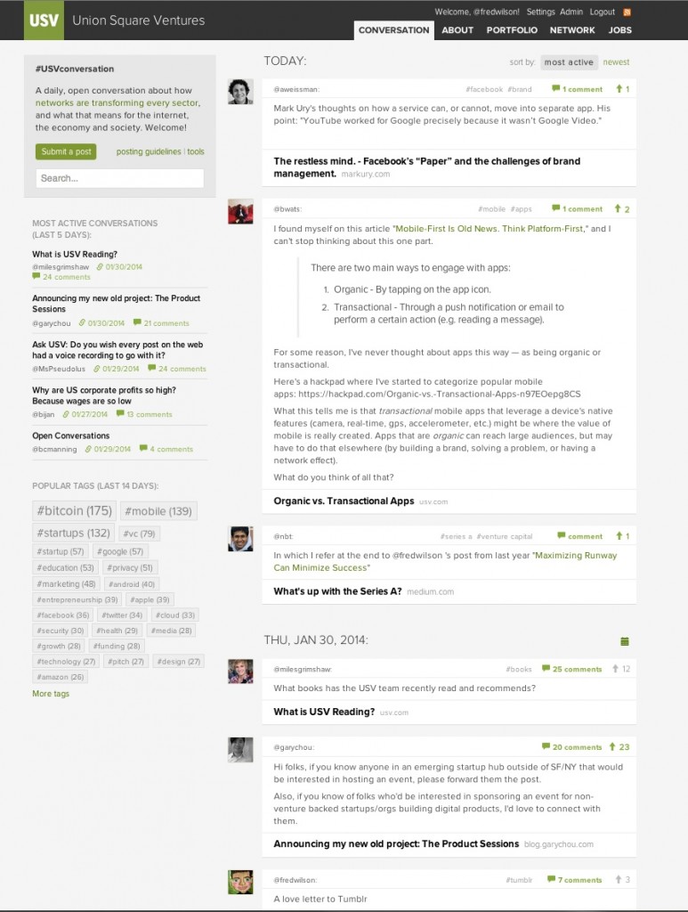
For those of you who did not click on that link, here is what it looks like:
The big changes are:
– Infinite scroll. This is something I’ve wanted since day one. I am so happy.
– All posts on the front page. No posts hidden behind the new tab anymore.
– Posts are bracketed by days. So each day you can come and see everything that was posted on the previous day to make sure you didn’t miss anything.
– Posts are inside a “card” that shows the poster, tags, comments, bumps, the link, and for the most popular posts, a blurb from the poster about the link.
– The left and right columns have been switched.
– Search is now prominently featured at the top. Yesssss.
So that’s it. I’ve been using this new UI for the past two weeks and I can’t imagine using the old one anymore. I like it way better. I hope you all do too.
